
2025
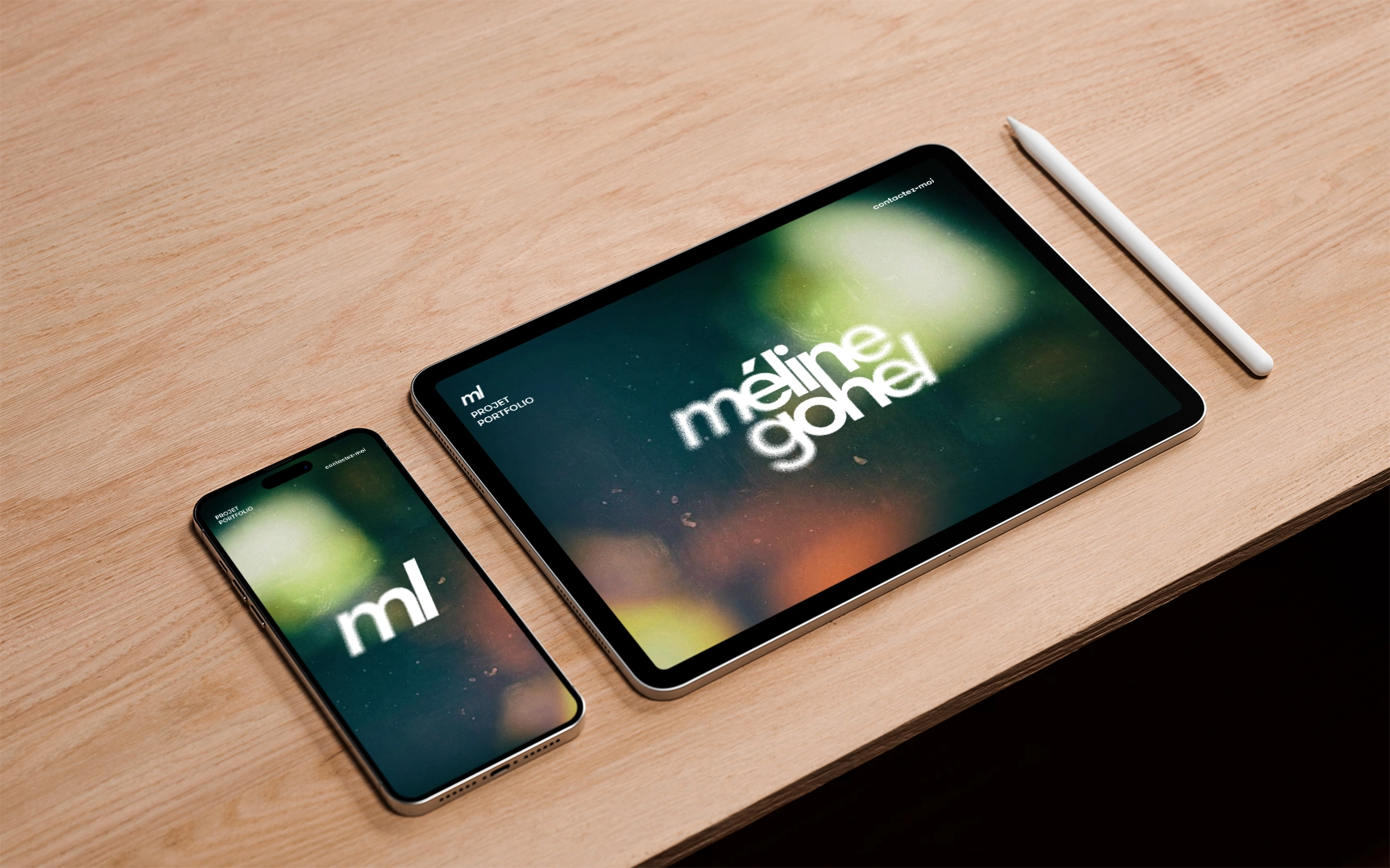
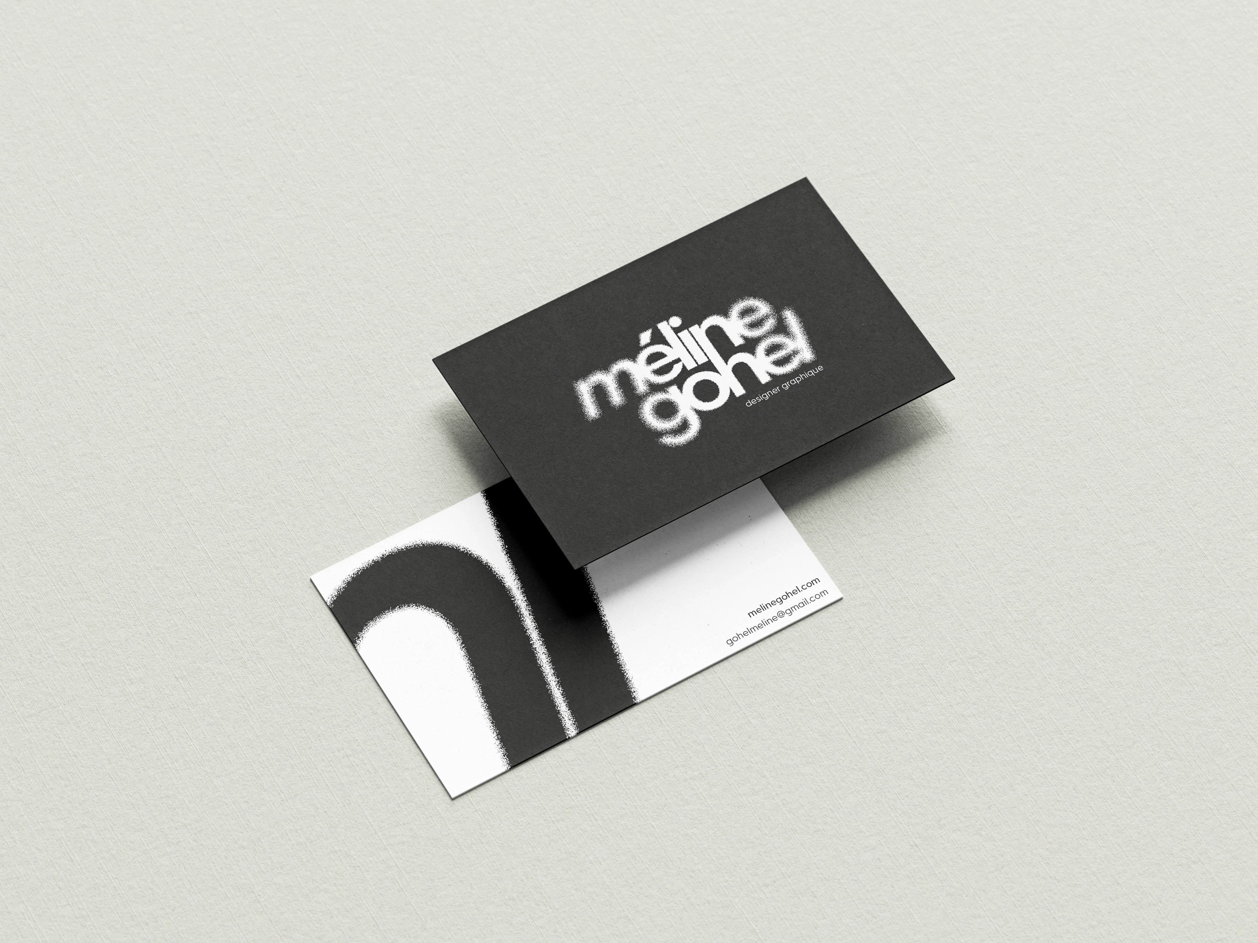
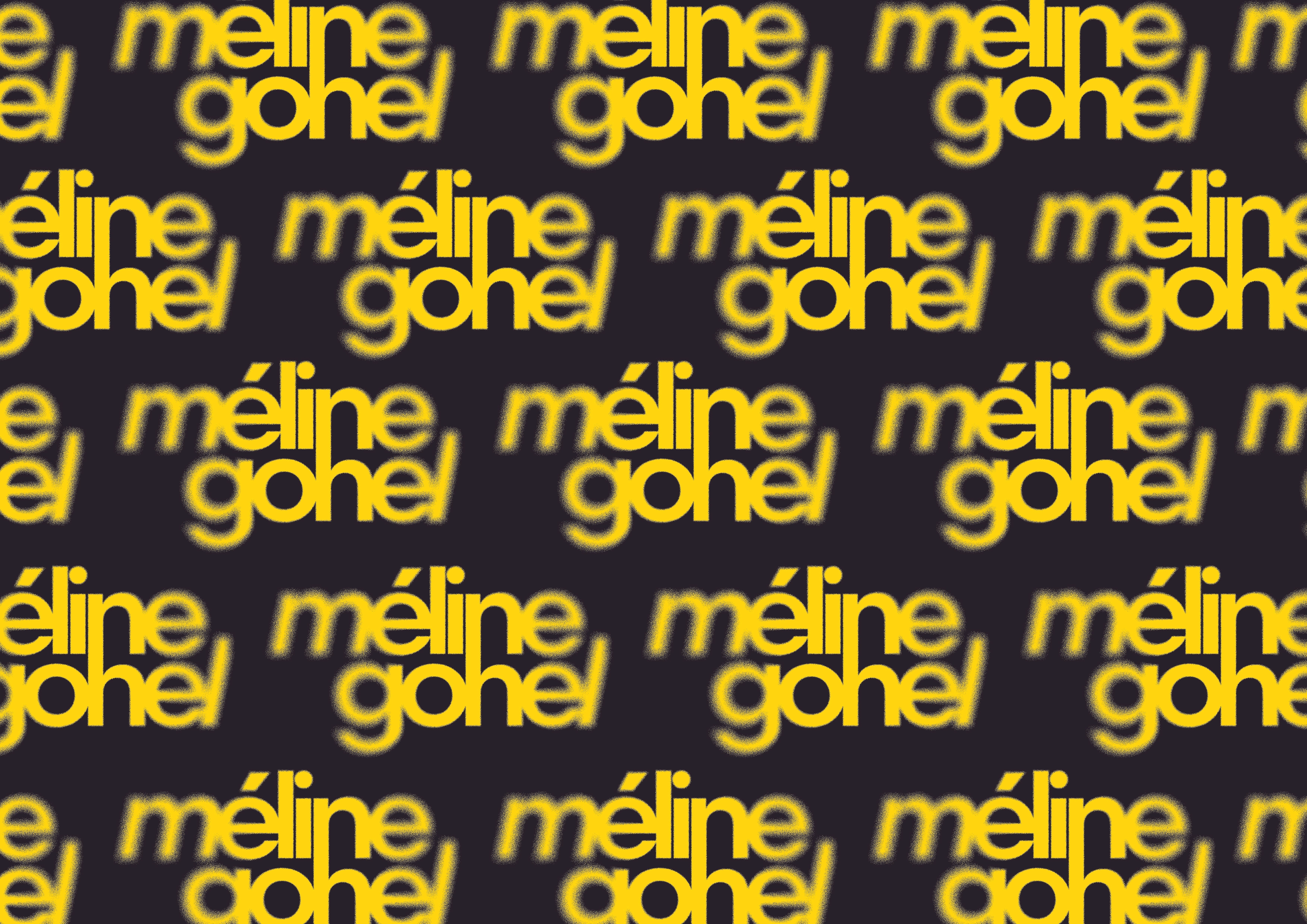
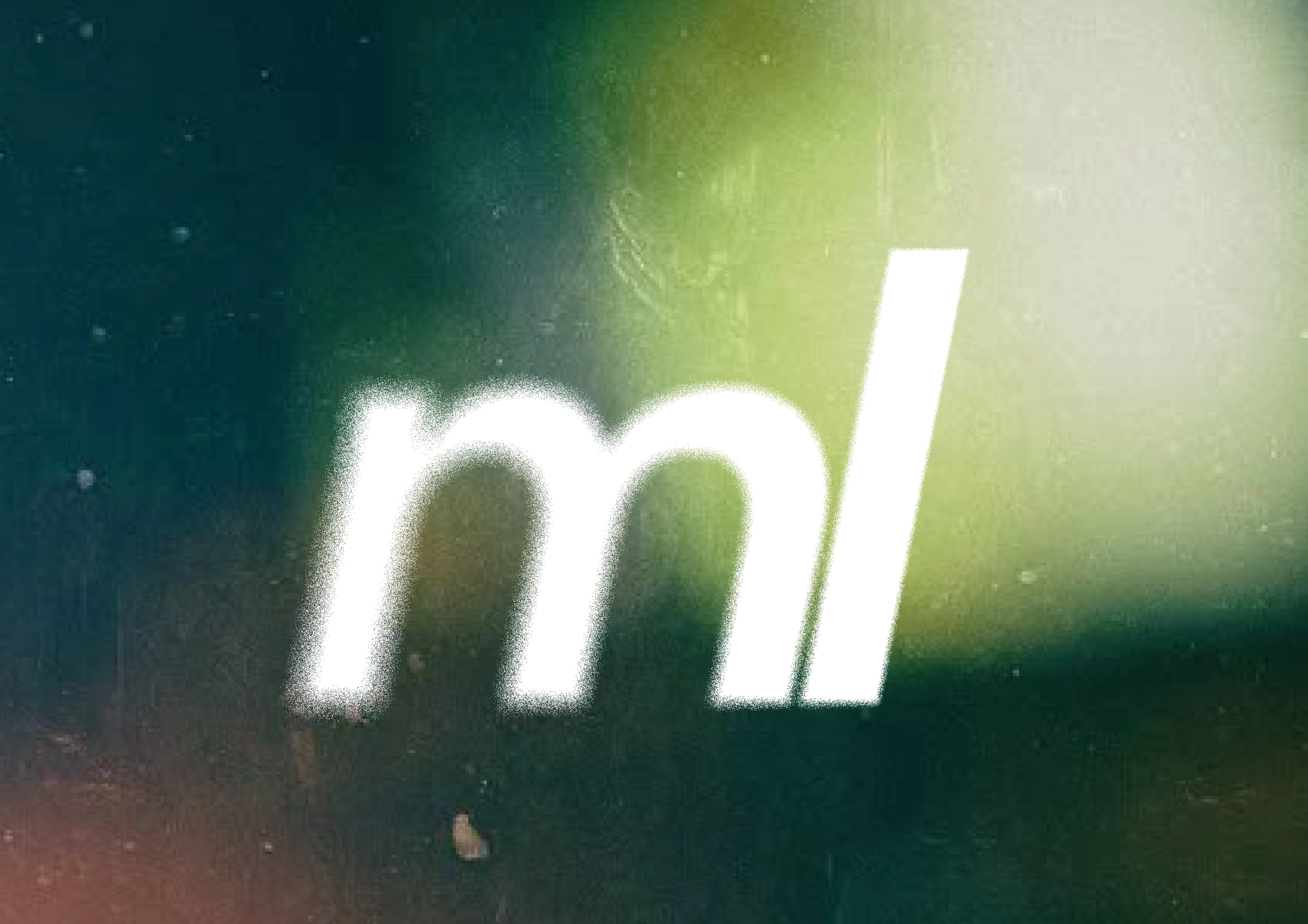
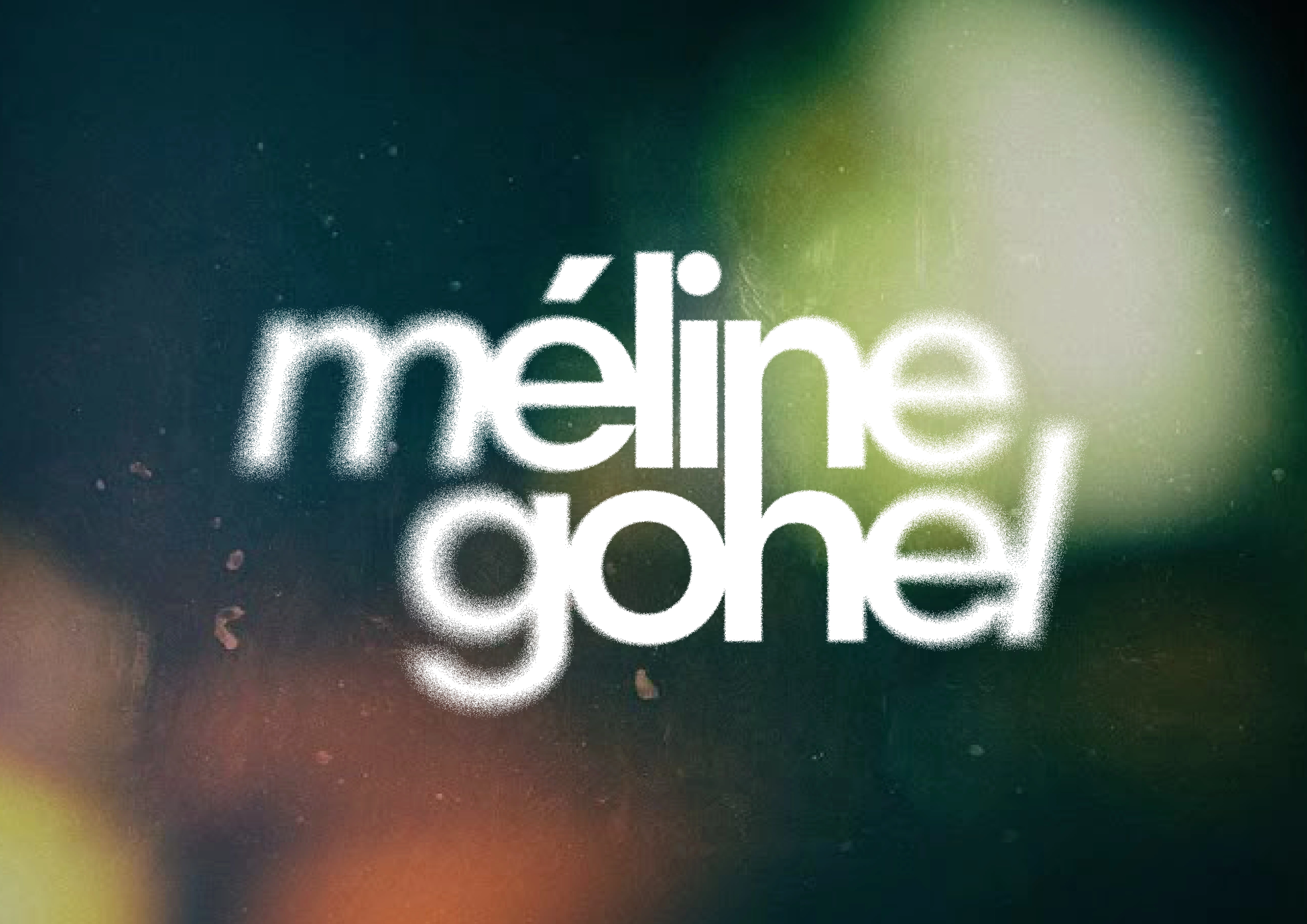
To assert my positioning as a graphic designer, I created my personal visual identity and typographic logotype. Aimed at design agencies, art directors, motion design, and post-production studios, this logotype reflects the versatility of my practice across print, digital, and audiovisual media.
It is based on a halftone blur effect that brings together three visual worlds: the texture of graffiti, the halftone typical of graphic design, and motion blur from video. This combination creates a dynamic aesthetic, both street-inspired and elegant.
The linear typography, modified with a connection between the “n” and the “h,” symbolizes the link between my two fields. The whole forms a coherent identity, where typography is at the heart of the project and my graphic and audiovisual influences come together to define my style.
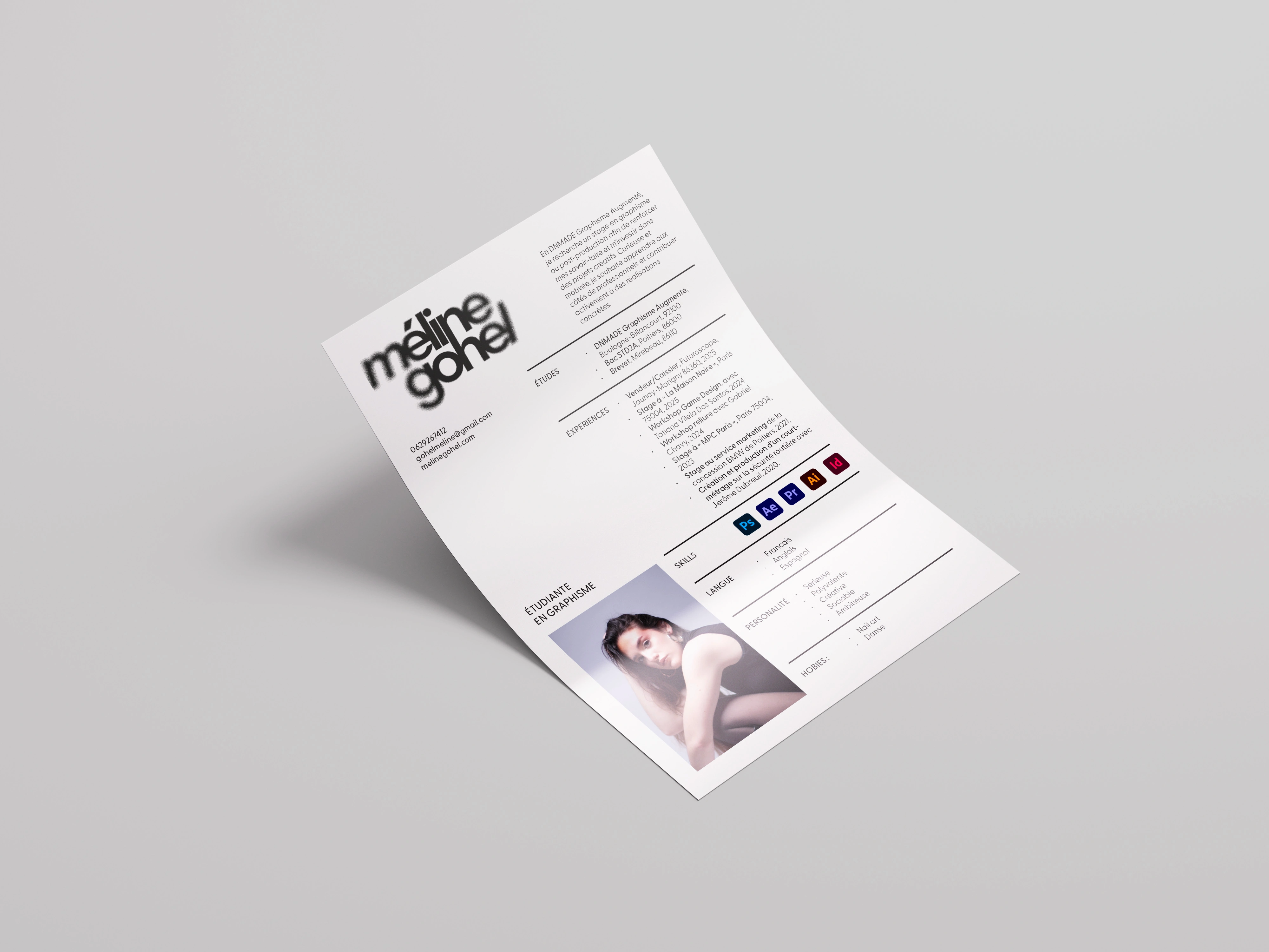
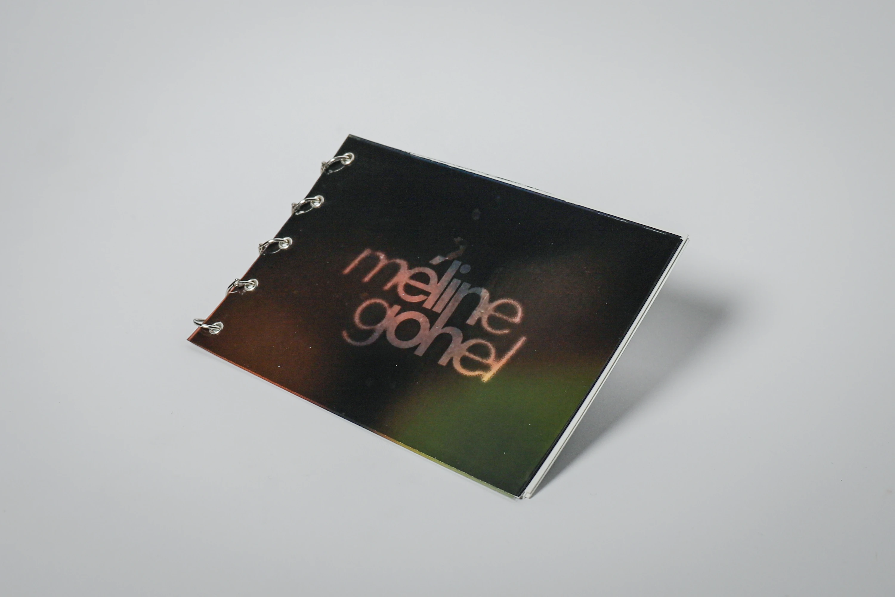
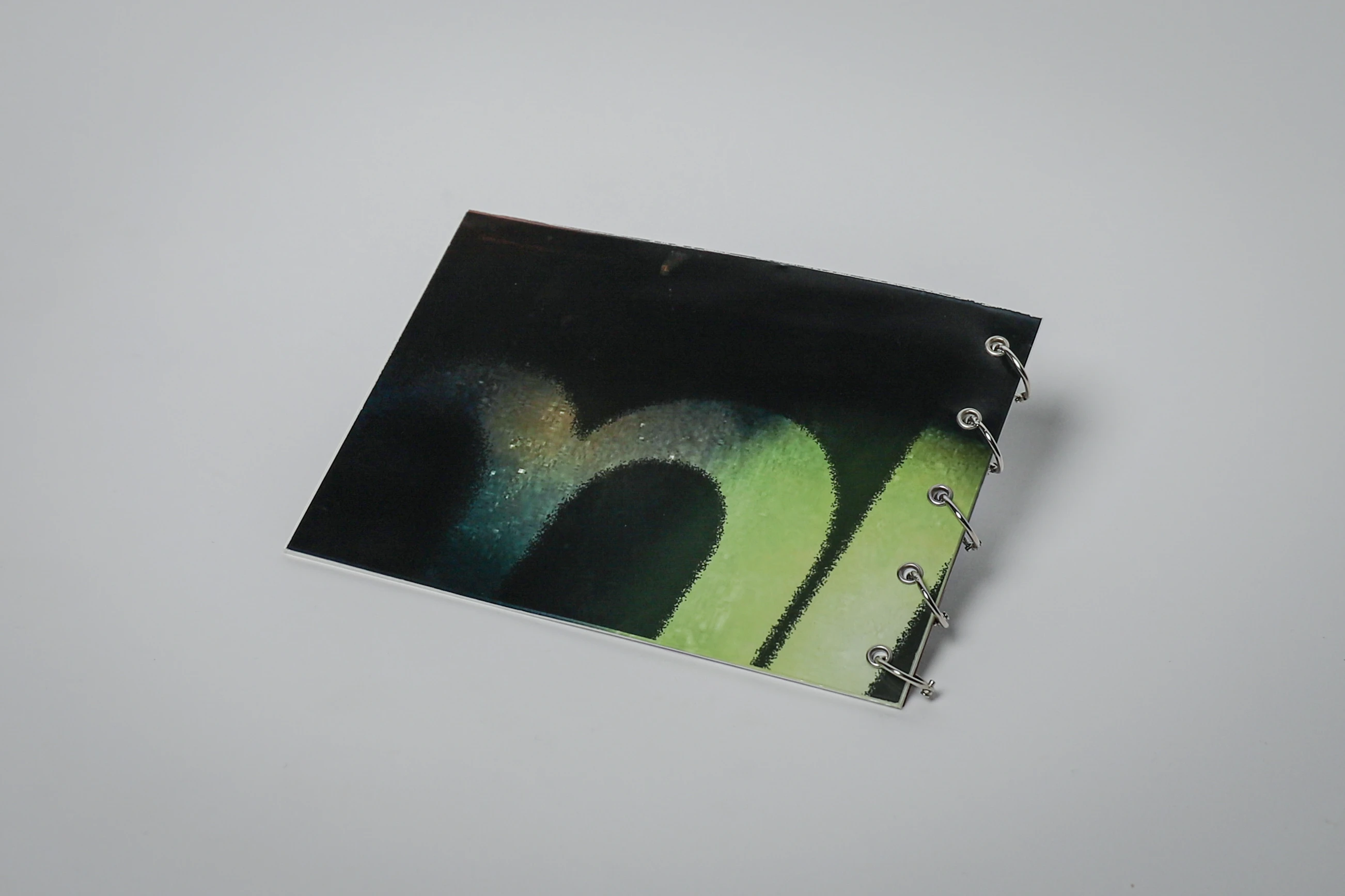
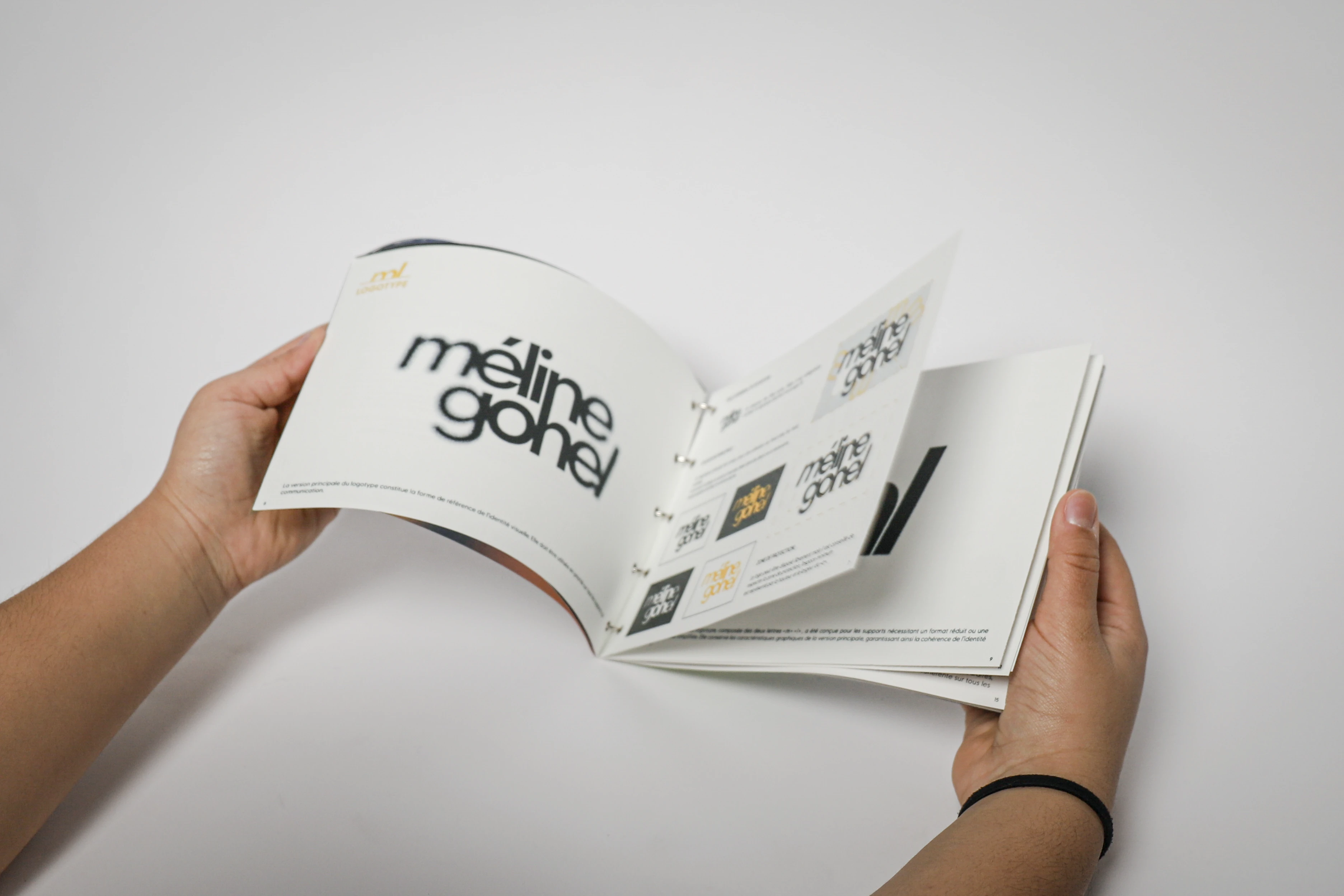
The logotype was adapted and applied in a printed graphic charter, which defines and frames its usage.
Graphic design, Visual identity, Art direction, Typographic design, Brand guidelines, Editorial design.